Ori and the will of wisp:
Redesigning a Game Webpage
Field :
My Role
Project Goal:
Design Goals:
Video Games
UX Research, UI Design, Prototype
Redesign Ori and the Will of Wisp webpage
Maintain overall UI design from the site
Create a more user friendly webpage
Update the UI and UX to be more modern and clean cut
Background:
Gaming was a new hobby I picked up over the last year, as many did over quarantine. So for this project I was looking for an opportunity to improve user experience for other gamer and so I decided to redesign the webpage for one of my favorite games. I started off this project by researching couple games I have played over the last 2 yrs, so that I can use my knowledge of the game’s UI and UX to better design it’s website. I played the Ori game series: Will of Wisp and Blind forest, by Moon Studios over a year ago and had loved both games and had an overall easy user experience as a new gamer, and I know long time gamers who also enjoyed the game. And so I wanted to redesign the web page for Will of Wisp (also the home page of the site) to improve potential or current players’ experience. Because of the website’s artistic UI, I wanted to take this opportunity to focus more on the UI design and developing my technical skills.
Development Stages
Objective:
Understand Ori and the Will of Wisp game page
Product Research
Method :
Process:
Product Analysis
In order to understand the product, I started by exploring the webpage for Ori and the Will of Wisp. the website consist of 6 primary pages: New, Will of Wisp, Blind Forest, Media, Moon Studios and Store. The Will of Wisp webpage acts as both the site’s home page as well the marketing page for the game. While the page itself have very few content on it, I could also find Will of Wisp related content on other pages of the site. Four of the primary pages(i.e. News, Media, Moon Studios and Store) had the general expected content according to each title, but the Blind Forest and Will of Wisp pages are inconsistent both content and layout wise. So in order to better understand what the site already has to offer, I gathered a list of contents and features from all pages.
Findings:
The site’s current contents could be organized in categories
Information about the developer: Moon Studios
Information about the 2 games: Will of Wisp and Blind Forest
Media content : news, videos, images and etc.
Merchandise
Pages Feature ComparisonUser Research
Method :
Process:
User Interview
Once I had a good understanding of the product, I interviewed couple gamers to understand their experience of game sites. For this I formally interviewed 2 gamers who regularly play video games about their experience of exploring new games and doing research on new games they are looking to play. At the end of each interview, i had open dialogues with both participants about their overall experience and objective of visiting game sites and. I later also consulted 2 other gamers about their experiences.
Findings:
Steam is the primary site people use to research games
Key information users look for are specification about the type of game and technical hardware and software requirements
Users expect the game page to portray the overall visual and artistic experience
User InterviewMarket Research
Method :
Process:
Competitor Analysis
During user research, Steam and Nintendo were referred to as competitor sites people most often use during their research for games they are looking to play. And since both brands also own one of the most popular gaming platforms like Nintendo Switch and Steam, Will of Wisp game page has quick links to it’s game page on both platforms. I then compare the game’s page to that of Steam and Nintendo to do feature and content availability.
Objectives:
Define user requirements
Define product features
Defining User Requirements
Method :
Process:
User Persona
Based on my findings from user research, I created a user persona for this project so that I can keep the user’s objectives and goals in mind when redesigning the webpage.
Defining Feature Requirements
Method:
Process:
Product Value Proposition
Before defining the specific features of the webpage, I decided to work on solidifying a Product Value Proposition since one of the objectives of the product is to market the game. I started off by gathering key informations i’ve gathered through my research. I then reached out to 6 personal networks and asked them to vote on their favorite PVP for the game’s site.
My initial goal was to incorporate the PVP on the website, but decided against it during wireframing. However this process still proved to be helpful in defining the product.
An example of Final PVP usageInformation Architecture
Metod:
Process:
Feature Roadmap
Once I had a clear undersing of the user and product objectives, I started off my making a list of existing features of the webpage and features to add to the page. I then prioritized those features based on production value. And since I will only be redesigning the webpage, I decided not to worry about further diving into IA and instead using that time on the visual design.
UI Kit
Method :
Process:
UI Kit
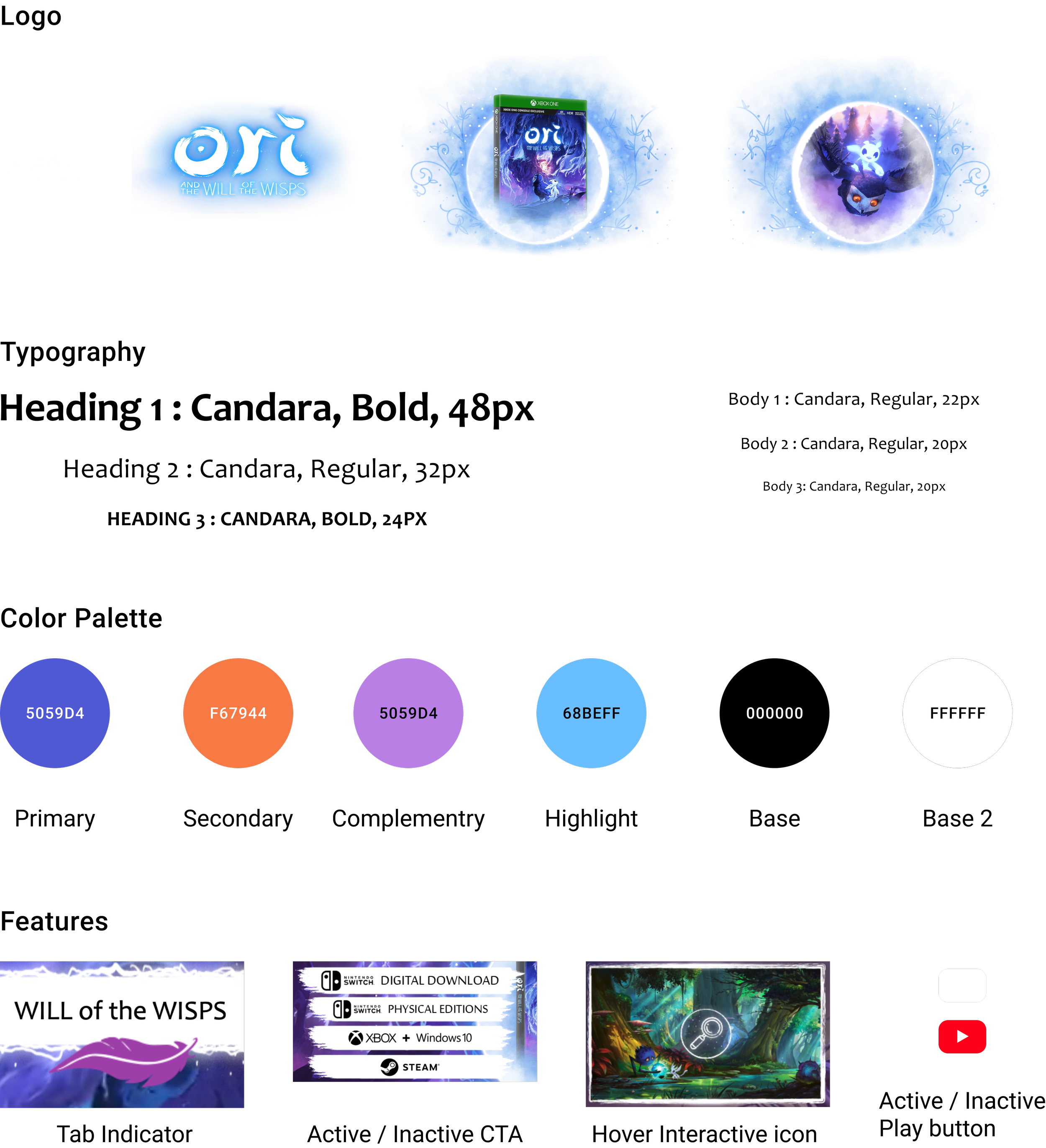
Before jumping into visual design, I created a UI kit of the webpage. This included key elements and features listed below along with several pictures I downloaded from the site not included on the picture. This part of the process was helpful for me in understanding the features and components I’ll need to consider during wireframing and design brainstorming.
Objectives:
Brainstorm product layout
Wireframe Webpage
Design Layout
Method:
Processs:
Layout Brainstorm
To begin the design process, I took screen shots of the current site to recreate the current screen. Once I had that, I created couple iterations of possible page layout, including one mimicking content layout of the Blind forest webpage. For this process, instead of sketching out on paper, I played around with different screenshots from the website so that I can use as many features and components from the site to stay as close to the website’s overall design as possible.
During this process, I revisited the feature roadmap repeatedly to make sure the web redesign is staying true to what’s possible for the first phase of the redesign. I also didn’t want to add too many new components to the page since there will be a bigger focus on visual design, which also required me to spend more time on technical skills with editing pictures, that I am not too familiar with.
Lo-fi Wireframe IterationsHigh-Fidelity Wireframe
Method:
Process:
Hi-Fi Wireframe & UI Design
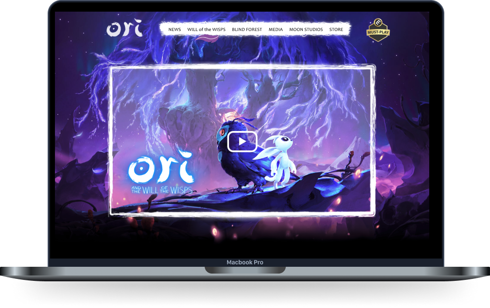
For the final wireframe, I started by organizing general content layout. I then gathered images (background, roof, floor and etc) from the site and edited them on adobe illustrator for later use. Once I had everything, I created 3 different frames: 1. a frame with all the content and fixed background 2. a frame with all the contents, except moving backgrounds 3. a frame with just the background pictures, which will be the exact replica of non animated parts of the page.
Unlike other high-fidelity wireframes, the final high fidelity for this project felt unfinished and simple since I was designing one page and the page had multiple components that needs to be animated for the end product.
Objectives:
Build an interactive prototype to test the new webpage
Prototyping
Method:
Process:
Hi-Fidelity Prototype
For the prototype, I tried couple different ways to link each section of the content to recreate the animation of fixed background and scrollable content. After spending multiple hours on research and testing, I finally ended up using Figma's Parallax effect to recreate the webpage animation. While the effect still isn't perfect, it was the closest I could get. For this effect to work on a desktop design, I ended up creating multiple screens that link to one another when scrolling back and forth. After I finalized the prototype, I tested the prototype with 2 users and in both instances, the prototype didn’t work as flawlessly as i had anticipated.
So then after further research and going back to the drawing board, I ended up using the parallax effect with nested frames that allowed me to animate separate components differnety.
Reflection On The Project
Key Takeaways:
It is helpful to approach UX research for re-design projects on a blank slate, in order to clearly understand user expectation.
Having a Product Value Propositions can help solidify your product objectives and can later help define your project priority, regardless of whether you end up using it or not.
Next Steps:
Re-design other pages for the site to tie together the overall site
Create responsive wireframes for the site
Add P2+ features to further build out the webpage


