MIRROR:
Branding and responsive e-commerce site design for a global brand
Field :
My role :
Project Goal :
Design Goal :
Fashion, e-commerce
Branding and Product Designer
Design a new logo and an e-commerce site for a global clothing chain
Design a new logo
Design a responsive e-commerce site
Aim for a modern, neutral, and fresh branding
Development Stages
Objective:
Understand users and the company to better understand the product I’ll be designing
Market Research
Market and User Research
By this stage in the process, I have a clear understanding of the business objectives, but I needed to further learn more about the product I’m building, the market standards and the users and their experience of pre-existing products that they have access for. With that in mind, I started off by doing market research about brands that provided similar products as Mirror - affordable and stylish clothing with good quality. Which lead to competing brands like Zara, Uniqlo and H&M.
I then sent out a quick survey among my friends and acquaintance regarding their shopping experience and recruited 5 participants, who shop at brands like mirror, to better understand their needs, goals, frustrations and shopping behavior in order to keep our potential user in mind when designing the product. I then scheduled interviews and live observations of these participants to observe and understand interaction with existing sites.
Observation notes of participant #1
Screenshot from virtual live observation of participant #4
After conducting my user research, I was able to synthesize the research data to better understand the product we need to build based on our users’ goals, motivations, needs and frustrations. These data mostly supported the business goals that required a clean and simple site, but also gave me better insight into the features and content users expect. Since these users are mostly familiar with technology and have easy access to technology and other web products, our product need to aim to solve their frustrations around general noise, and increased clarity and efficiency of the way we display and categorize our product.
Objectives:
1. Define the user and their needs based in the user research findings
2. Define the product’s key function and the general design direction
Defining User Persona
Once I was done with user research I revisited my notes from the interviews, video recordings of the interviews and live observations to an empathy map of the biggest user group- the young urban professional. Both market research of our competitors and user research of our potential customer base indicated that the majority of our customer are young urban professionals who are looking for affordable clothing for different occasions. These user are often driven by the style, quality and price of the product. I then used the empathy map to create a user persona - Kimberly Payne.
Young Urban Professional - Empathy Map
Young Urban Professional - User Persona
Information Architecture
Once I had the demographic of our user identified, I revisited the sites that the participants used in order to better understand the content categorization of the products that they are familiar with. I also researched other sites to explore options for how Mirror’s content could be categorized. I then listed all the site features and categorized them to prioritize the features. This allowed me to get a broad understanding of the pages and features we would need to design.
I then recruited a total of 20 participants for a card sorting exercise in order to help with the inventory categorization of the site. The 20 participants, who fit the demographic of our user, were then asked to do a open card sorting exercise 40 total pictures of different clothing. The data of the card sorting was a bit difficult to synthesize because all participants interpreted categories very differently. The card sorting exercise helped me identify the most common ways my prospective clients categorize clothing :
• About 59% of the participants identify clothing based on the type of clothing
• About 31.1% categories were based on use context
• About 18% categories were based on style, especially with women’s clothing.
These data indicated that I should organize Mirror’s catalog based on clothing types and add features to that will allow users to filter through the catalog based on use context and style.
With that in mind, I created user flows with our persona in mind, to better understand the necessary pages and features to build for a complete browsing experience.
Product Features Roadmap - View Full Roadmap
Brainstorm ideas for logo, branding and low-fidelity wireframes
Objectives:
Sketches and Wireframes
Now that I have a clear understanding of both the business needs and user needs, it’s time to brainstorm ideas for logos and pages.
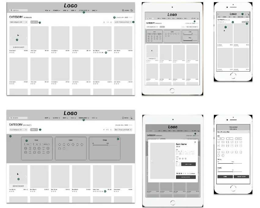
I started off by sketching out different versions for the home page and the catalog page, since those two generally have the most traffic and are the “busiest” pages. User interviews also indicated that the majority of user frustrations are usually on the catalog page. Once I had a broad idea of the layout I wanted to use, I created responsive wireframes for 3 screen types and reached out to couple of my earlier interview participants to ask how they felt about the catalog page. I overall got mixed review regarding the hidden filter navigation on the desktop and tablet layouts. While some loved the overall clean look, most of them seemed confused and/or took an extra few seconds to access the navigation. Also it was a proper usability testing, it was enough reason more me to iterate more designs and to add navigation column on the catalog page. I then used the final result as my guide for creating low-fidelity wireframes for the rest of the pages.
Logo Design Iterations
Page Layout Sketches
Initial Responsive wireframes
Annotated Web Based Wireframes
Branding
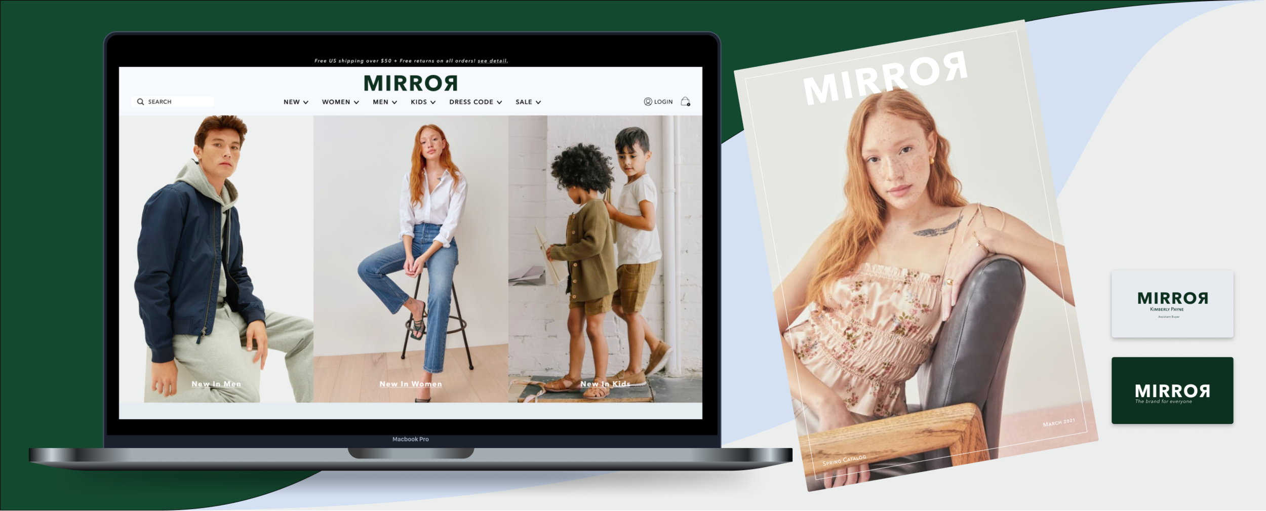
I wanted Mirror’s brand to embody modernistic, simplicity, and minimalistic. Every research so far has pointed to those being key in creating a simple and an easy to navigate e-commerce site. We also need to indicate that the brand needs to take clear and simple images that clearly display the product and need to show that the product are also good quality. To achieve that, I decided on a simple and cool color palette with dark green as the primary color, which symbolizes trust, friendliness and prosperity. I also settled on the simplest final logo to resemble those of high end brands, so that the brand can embody the same aesthetic. Along with the style tile, I created UI Kits for use during the next stage.
Style Tile
UI Kit
Sample Catalog and Business Card
Build out a clean, modern and simple UI of the product
Objective :
Hi-Fidelity Prototype
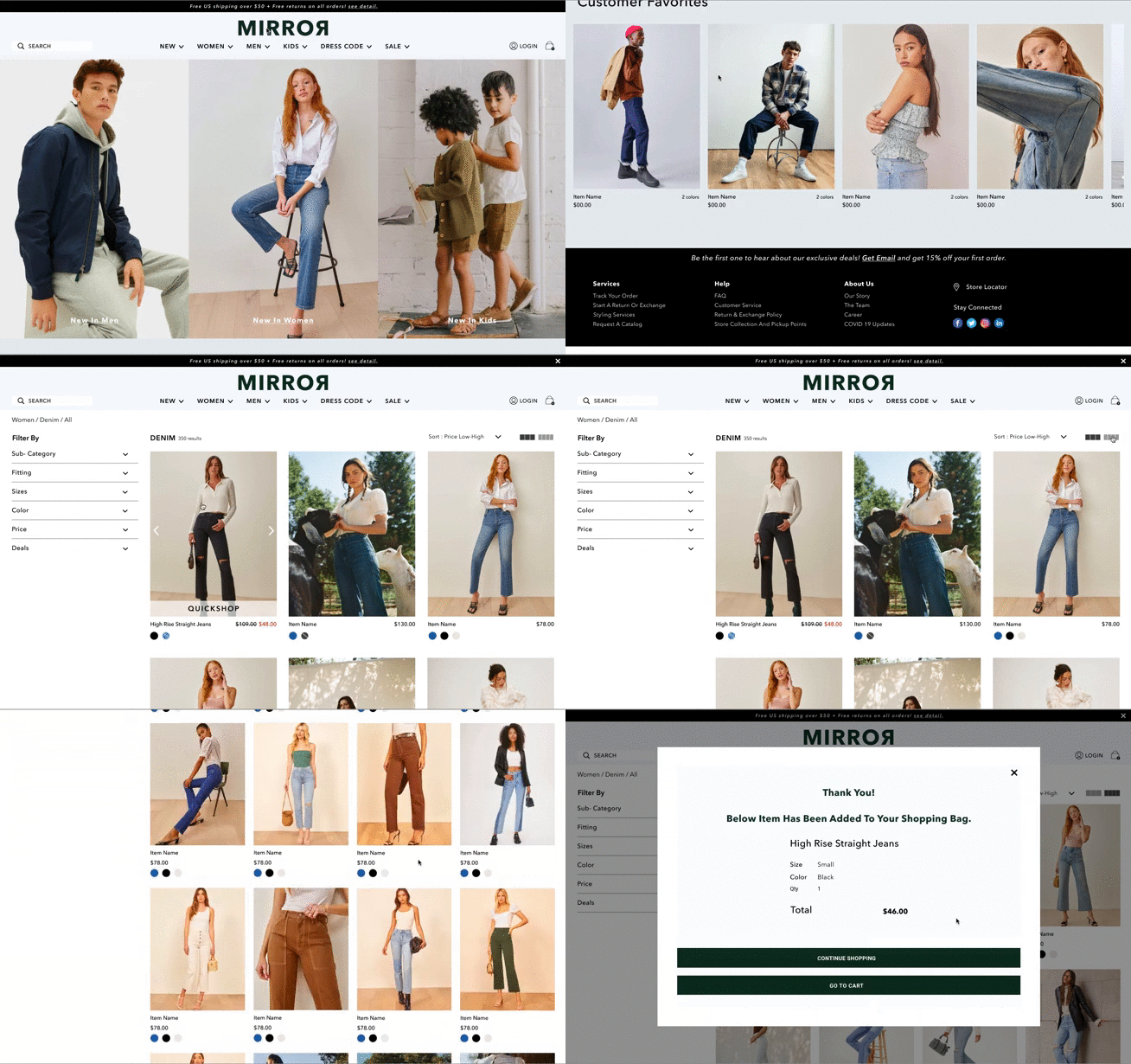
Using the style tile and the UI kit I started working on my initial web based wireframes. The wireframe consisted of all the pages necessary for the user flows to browse and add an item to a shopping cart and created a prototype.
Initial Complete Wireframes
Completed Prototype
Web-Based prototypes
Home Page
Top Navigation
Quickshop View
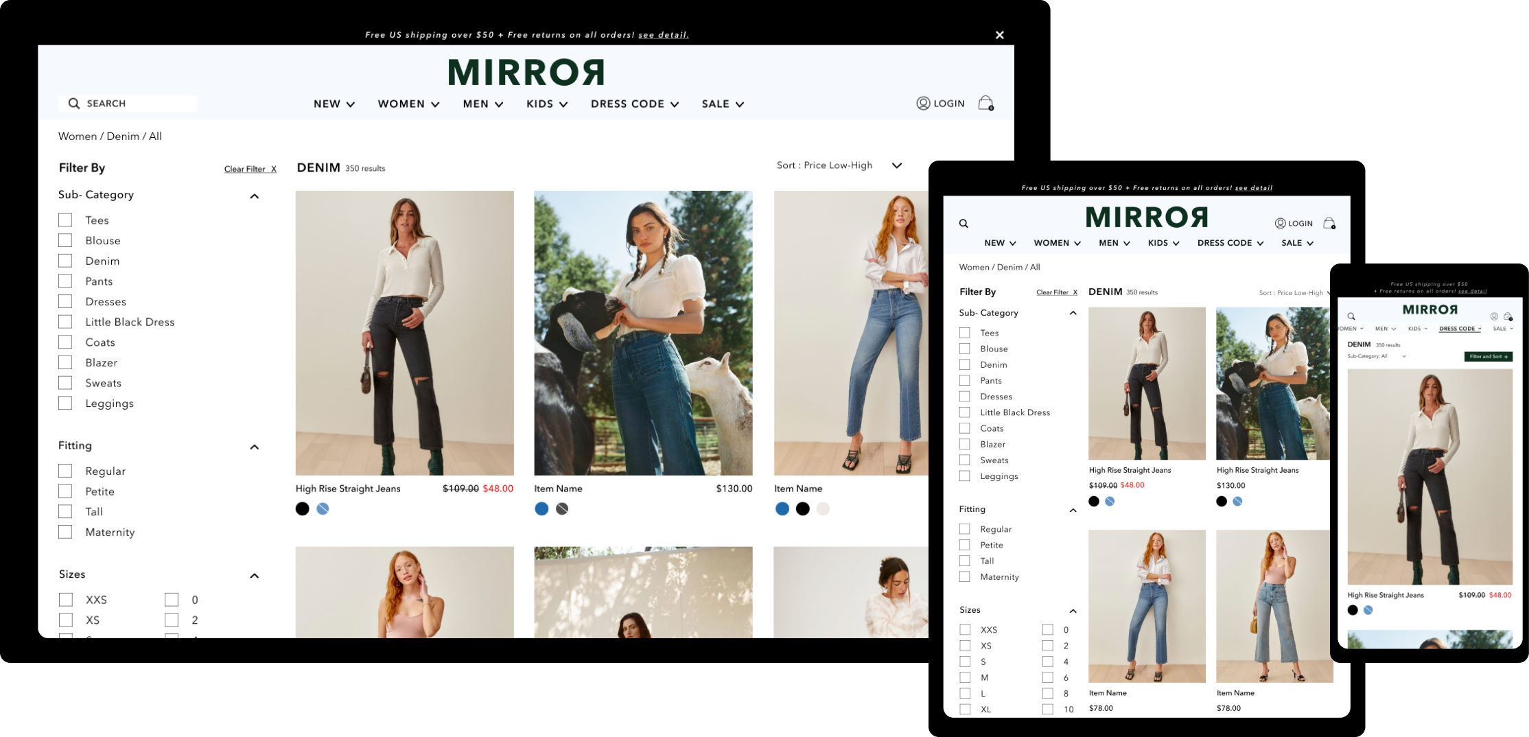
Responsive UI
Once the web-based wireframe turned out well, I worked on creating responsive wireframes for the catalog page since the content layout of the page generally tend to be the busiest and numbers of my research participants pointed out that their frustration with most e-commerce sites are on the catalog page.
Test product prototype with potential users for further improvement.
Objective:
Usability test
Once I had a completed prototype, I recruited 5 participants who fit our user persona to test the prototype. My two primary goals for the usability test were to understand people’s impression of the site to ensure the product achieves all the design objectives. And to test if the site is easy to navigate and find products without major error to ensure usability of the product.
Test Prompts:
1. Find a pair of black women’s jeans for casual wear and add to cart. You will start on the home page and are allowed to navigate through the site however you want.
2. Start from the home page and find material and care guide for the same pair of jeans- try to navigate the site differently.
3. Locate mirror’s return and exchange policy.
Participant #4 Usability Test
Participant # 3 Usability Test
Final prototype
The usability test proved that while I achieved all the design goals, there were minor UI that majority of the participants had questions about, specifically the functionality of the filter navigation and the way inventory images were presented in the catalog page. After the test, I did further iterations of the prototype and


